Theme documentation
Setting up Godet
Godet is a Shopify theme for fine jewelry and other considered, high-value products. This guide walks you through installing it, setting it up, and every section and setting it includes.
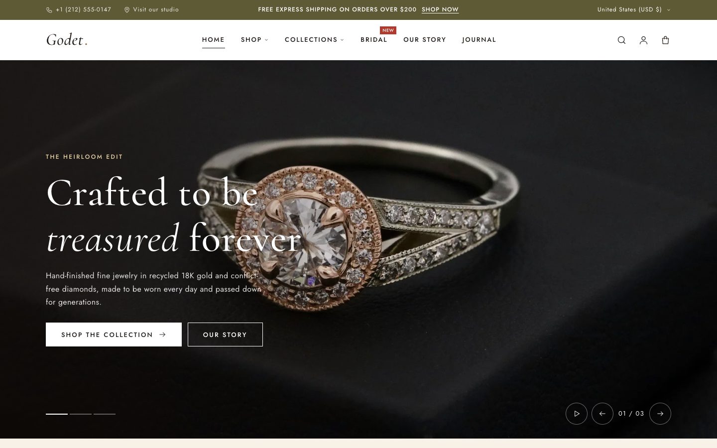
Everything here is done in the theme editor: Online Store → Themes → Customize. You don't need to edit any code.
Install the theme
From the Shopify Theme Store
- In your Shopify admin, go to Online Store → Themes and open the Theme Store.
- Search for Godet, then select Try theme to try it for free, or Buy theme.
- Godet is added to your theme library unpublished, so your live store doesn't change. Select Customize to start setting it up.
- When you're ready, select Publish.
From a .zip file
If you received Godet as a .zip file, go to Online Store → Themes → Add theme → Upload zip file and choose the file. Don't unzip it first.
Theme updates from the Theme Store keep your settings and content. If you've edited the theme's code, Shopify can't update it automatically, so keep a list of your code changes.
First-time setup
Work through this list once and your store will look finished:
- Menus. In Online Store → Navigation, set up a
Main menufor the header and aFootermenu. Nested links in the main menu become dropdowns and mega menus. More on menus. - Logo. In the theme editor, open Header and upload your logo. If you don't add one, the store name is shown in the heading font.
- Colors and fonts. Open Theme settings (the gear icon) and adjust Colors and Typography to match your brand.
- Home page. Replace the sample images and text in each section, and remove the sections you don't need.
- Pages. Create an About and a Contact page and assign the matching templates. See About and contact pages.
- Social links and favicon. Add them in Theme settings.
- Search engines. Add a homepage title and meta description in Online Store → Preferences.
Using the theme editor
- Sections are the full-width bands of a page, such as a slideshow or a newsletter sign-up. Use Add section in the left sidebar to add one, and drag to reorder.
- Blocks are the pieces inside a section, such as slides, testimonials or product page details. Most sections let you add, remove and reorder blocks.
- Templates control the layout of each page type. Use the page selector at the top of the editor to switch between the home page, products, collections, pages and so on.
- Color schemes: every section has a Color scheme setting, so you can alternate light and dark bands without touching code.
- Headings that support it show the note “Use italic to apply the accent style to words.” Select words and press italic to set them in the accent color. That's Godet's signature heading style.
Colors
Theme settings → Colors has two parts.
Color schemes
Godet ships with four schemes. Each one sets the background, text, accent, buttons and image background for any section that uses it. Edit a scheme once and every section using it updates.
You can add more schemes with Add scheme. Keep text clearly readable against the background; aim for a contrast ratio of at least 4.5:1.
Brand colors
Accent (gold), Dark (espresso), Cream, Sand, Olive and Sale are used for details outside the schemes, such as the sale badge, decorative lines and hover states.
Typography
| Setting | What it does |
|---|---|
| Headings → Font | Font for titles and headings. The default is Cormorant, an elegant serif. |
| Headings → Font size scale | Makes every heading larger or smaller, from 100% (the default) upwards. |
| Body → Font | Font for paragraphs, buttons and navigation. The default is Jost. |
| Body → Font size scale | Makes body text larger or smaller. |
Fonts come from the Shopify font library, so they load fast and need no licence.
Layout
| Setting | What it does |
|---|---|
| Page width | The maximum width of content on large screens (default 1320px). |
| Button corner radius | 0 gives square buttons, the classic Godet look; increase it for rounded buttons. |
| Image corner radius | Rounds the corners of product and section images. |
| Reveal sections on scroll | Fades sections in gently as they scroll into view. It's turned off automatically for visitors who ask their device to reduce motion. |
Product cards
These settings control the product tiles shown in collections, search results and product sections.
| Setting | What it does |
|---|---|
| Text above title | Shows the product type or vendor above the product name, or nothing. |
| Show second image on hover | Swaps to the product's second image when a shopper hovers over it on desktop. |
| Enable quick add | Adds an “Add to bag” button to the card. Products with more than one option link to the product page instead, so shoppers can choose. |
| Show color swatches | Shows small swatches under the title, using the swatch color or image set on each option value. |
| Show sale badge | Shows the discount percentage when a product has a compare-at price. |
| “New” badge product tag | Products with this tag (default new) show a “New” badge. |
| Show low stock message | Shows “Only X left” when stock drops to the Low stock threshold or below. This needs Shopify to track inventory for the product. |
Cart
| Setting | What it does |
|---|---|
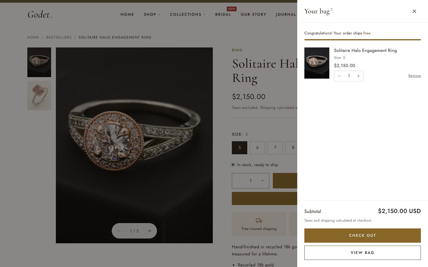
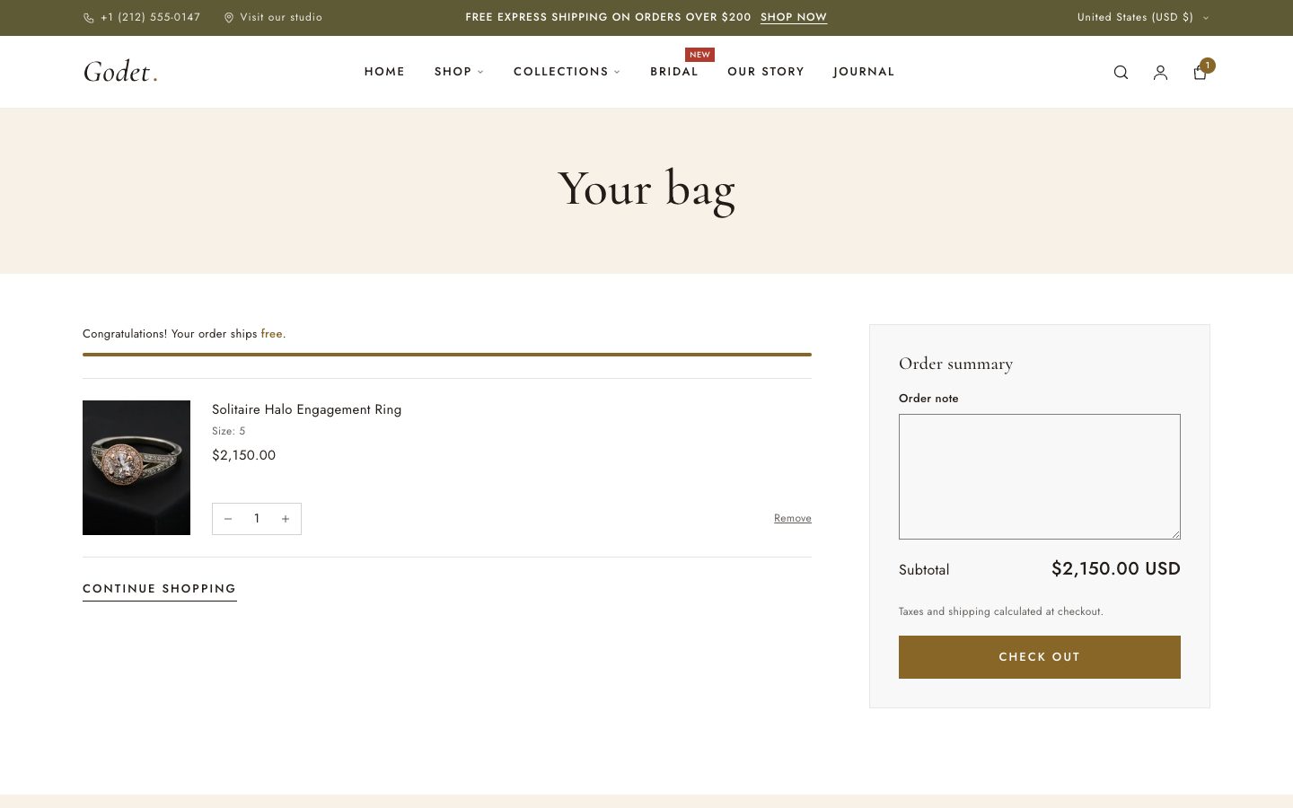
| Cart type | Drawer opens a slide-out bag without leaving the page. Page takes shoppers to the cart page. |
| Free shipping threshold | Shows a progress bar such as “You're $40 away from free express shipping”. Enter the amount in your store currency, or 0 to hide it. It's a message only: set the free shipping rate itself in Settings → Shipping and delivery. |
| Cart drawer color scheme | The color scheme of the slide-out bag. |
Social media and favicon
Add the full URL of each profile (Instagram, Facebook, TikTok, YouTube, Pinterest, X). Icons appear wherever Show social media links is turned on: in the footer and on the contact page. Upload a square favicon of at least 32 × 32px under Favicon.
Announcement bar
The olive bar at the very top of every page.
- Announcement blocks: each one is a message with an optional link. With more than one, they rotate at the Rotation speed you set, and pause while a shopper hovers over or focuses them.
- Phone number and Location label/link appear on the left on desktop. Leave them empty to hide them.
- Country/region and language selectors appear on the right when your store sells in more than one market or language.

Header and menus
| Setting | What it does |
|---|---|
| Logo / Logo width | Your logo image and its width on desktop. Without a logo, the store name is shown in the heading font. |
| Show accent dot after text logo | Adds the small gold dot after a text logo (“Godet.”). |
| Menu | The menu shown in the header (normally Main menu). |
| Badge menu item / Badge text | Adds a small badge, such as “New”, to one top-level menu item. Type the item's exact title, for example Bridal. |
| Show account icon | Shows the account icon in the desktop and mobile header when customer accounts are turned on. Customers can sign in, or open their orders and profile, from the panel it opens. |
| Customer account menu | The links shown in the account panel. Defaults to the Customer account main menu, the same menu used on your customer account pages. |
| Phone number in mobile menu | Shown at the bottom of the mobile menu. |
| Popular searches | Comma-separated suggestions shown when the search opens, for example Engagement rings, Hoops, Gifts. |
| Enable sticky header | Keeps the header at the top while scrolling. |
| Hide header when scrolling down | Slides the sticky header away when scrolling down and brings it back when scrolling up. |
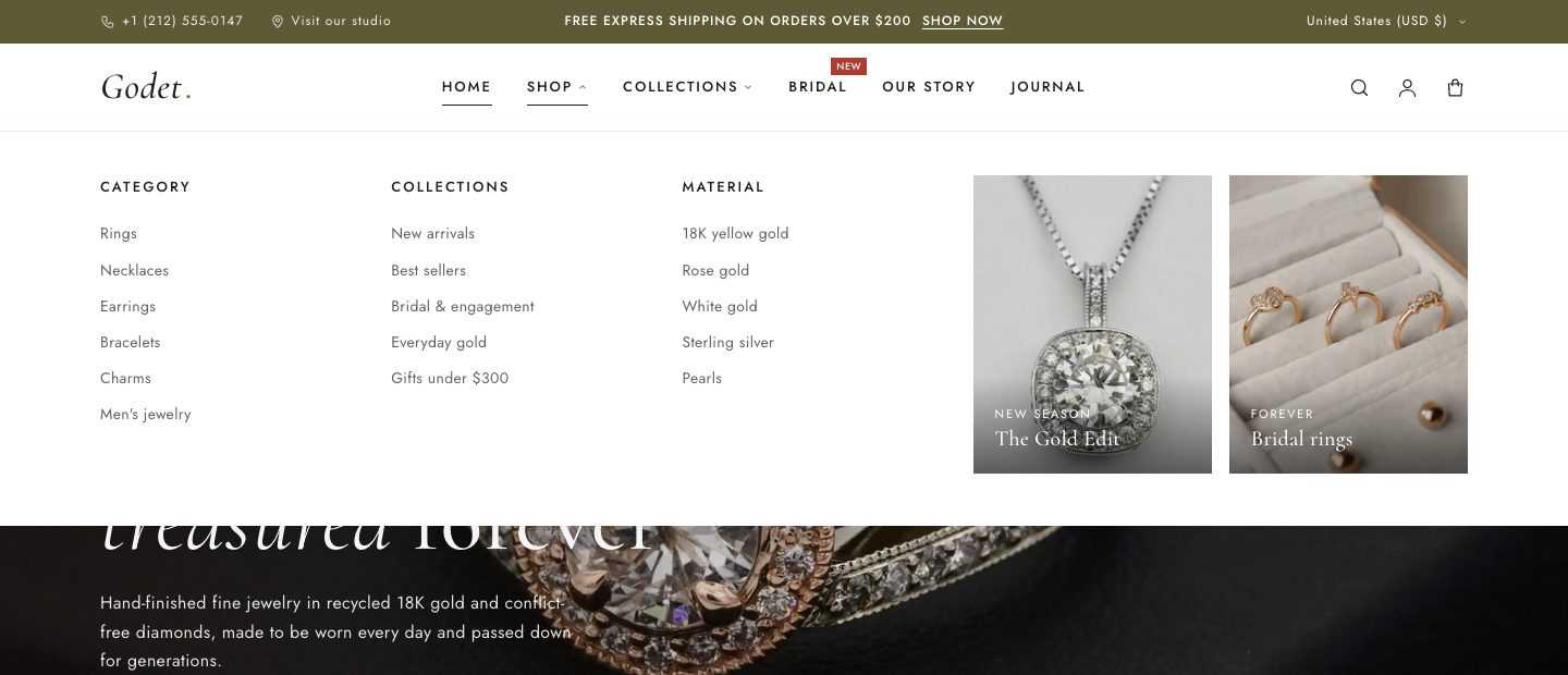
Dropdowns and mega menus
In Online Store → Navigation, drag links under a top-level item to nest them:
- One level of nested links gives a simple dropdown.
- Two levels (columns of links) give a mega menu.
- To add an image card to a mega menu, add a Mega menu promo block to the Header and type the exact title of the top-level item it belongs to, for example
Shop.
Footer
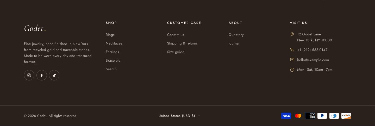
The footer is built from blocks:
- Brand: logo, a short paragraph, social icons and the Follow on Shop button. The button appears only when Shop Pay is turned on for your store.
- Menu: a heading and a menu. Add as many as you need.
- Contact: address, phone, email and opening hours. Empty fields are hidden.
- Text: a heading and free text.
Section settings control payment icons, policy links, the “Powered by Shopify” credit, and the country and language selectors.
All sections
Select Add section in the theme editor to use any of these on the home page or on any page template. Almost all of them have a Color scheme and Padding top/bottom setting.
| Section | Use it for |
|---|---|
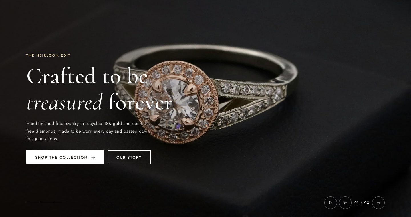
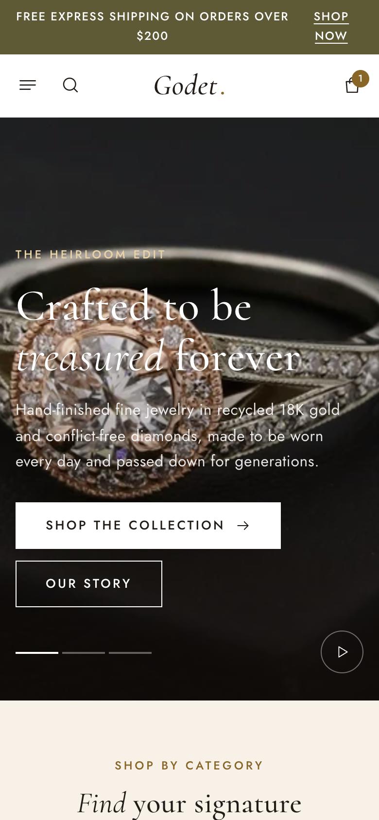
| Slideshow | Full-width hero images with heading, text and up to two buttons per slide. It has autoplay, separate desktop and mobile heights, and left or centered content. Set each image's focal point in Shopify's image editor to control cropping. When the slideshow is the first thing on a page, turn on Use first heading as page title so the page has one main heading for search engines and screen readers. |
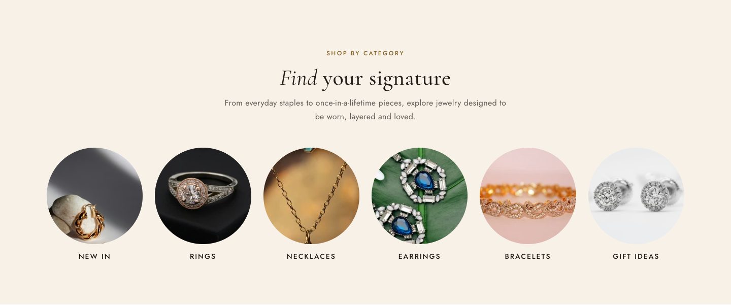
| Collection list | Circular image tiles linking to your collections, with optional product counts. |
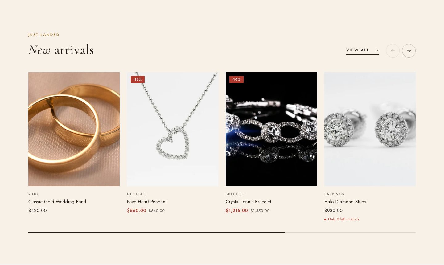
| Featured collection | A carousel of products from one collection with a “View all” link. |
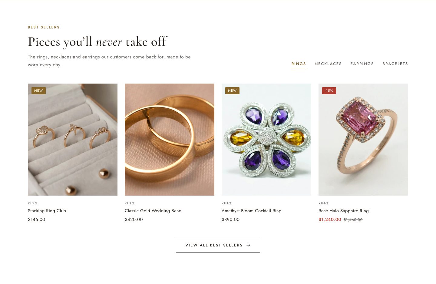
| Collection tabs | Several collections in one section, switched with tabs (for example Rings, Necklaces, Earrings). |
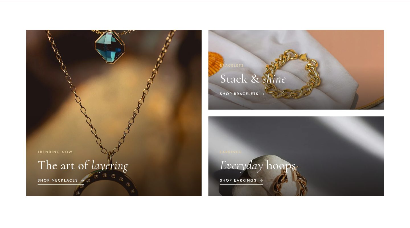
| Collage | Editorial image banners. The first one is shown large. |
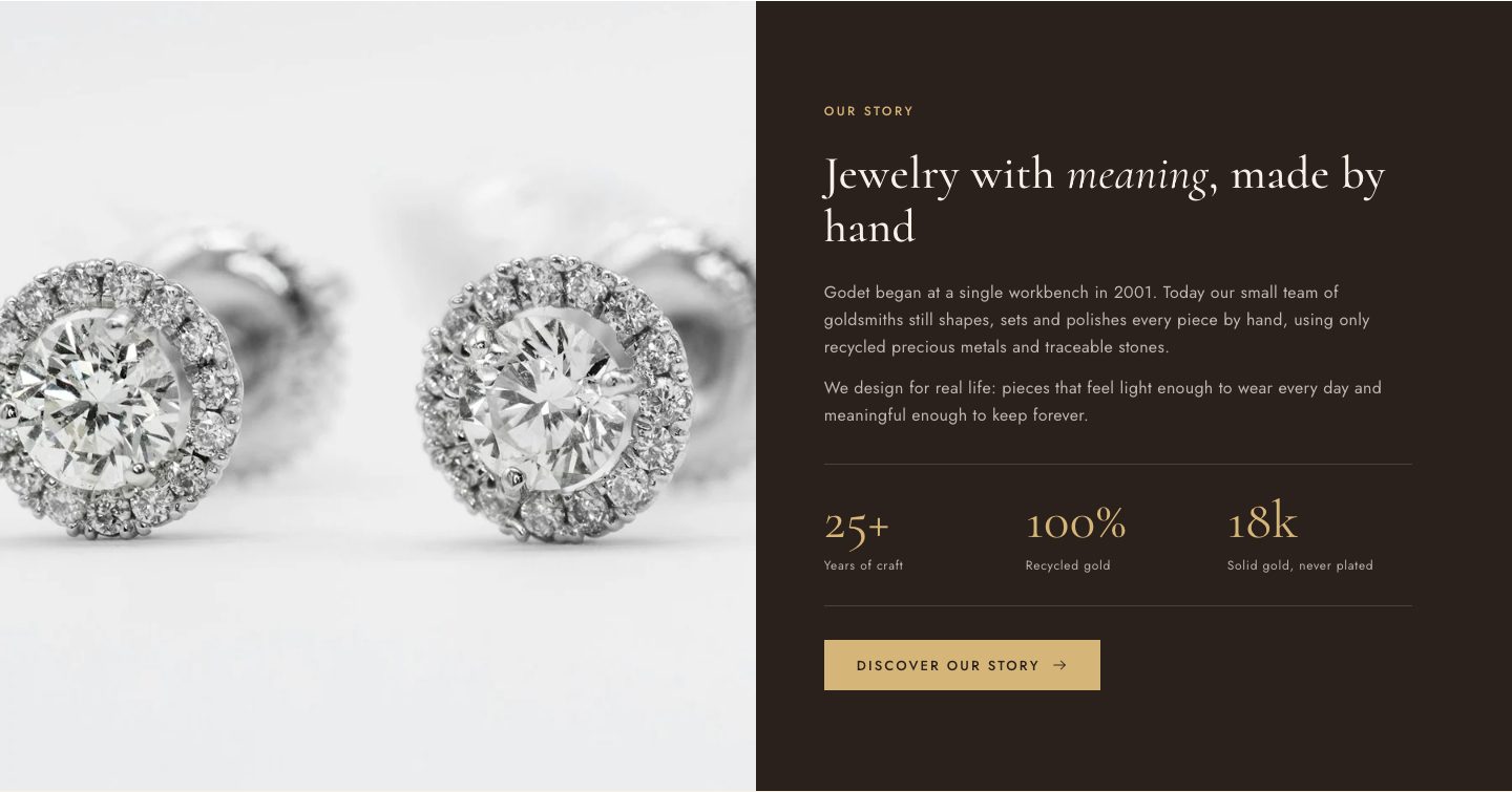
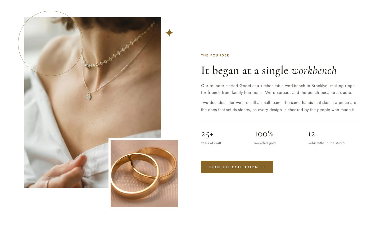
| Image with text | Your story beside a photo. Overlapping images layers two photos with a decorative ring; Split runs the photo edge to edge on one half. Add Stat blocks for figures such as “18k · Solid gold”. |
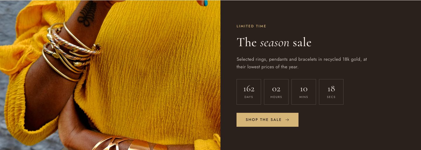
| Countdown banner | A limited-time offer with a live timer. Enter the end date as 2026-12-31T23:59:59. Pick a product to show its real price. After the date passes, the banner says the offer has ended. |
| Multicolumn | Short benefit columns with icons, such as free shipping, returns or warranty. |
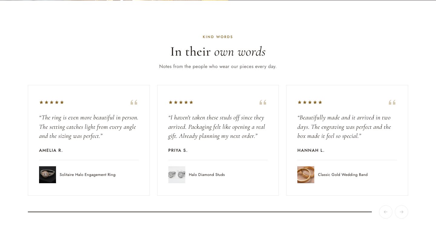
| Testimonials | Customer quotes in a slider, with a star rating, author and an optional linked product. Only turn on Show verified buyer label for reviews from confirmed customers. |
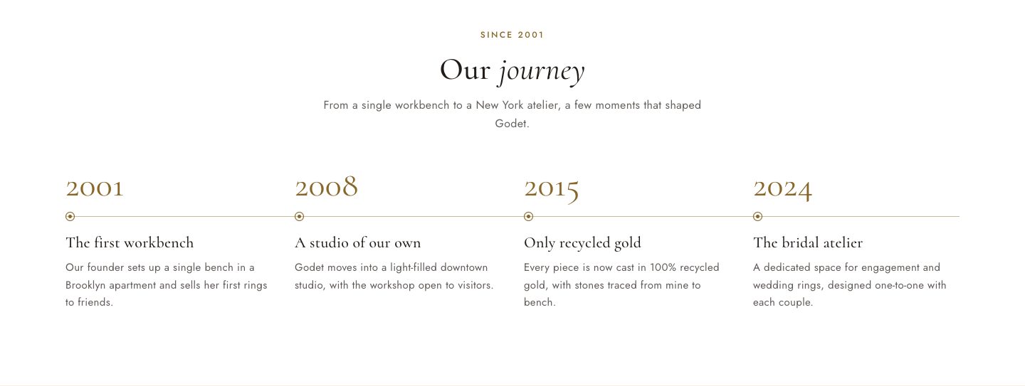
| Timeline | Milestones in your brand's history: year, title and text. Up to four per row on desktop, stacked on mobile. |
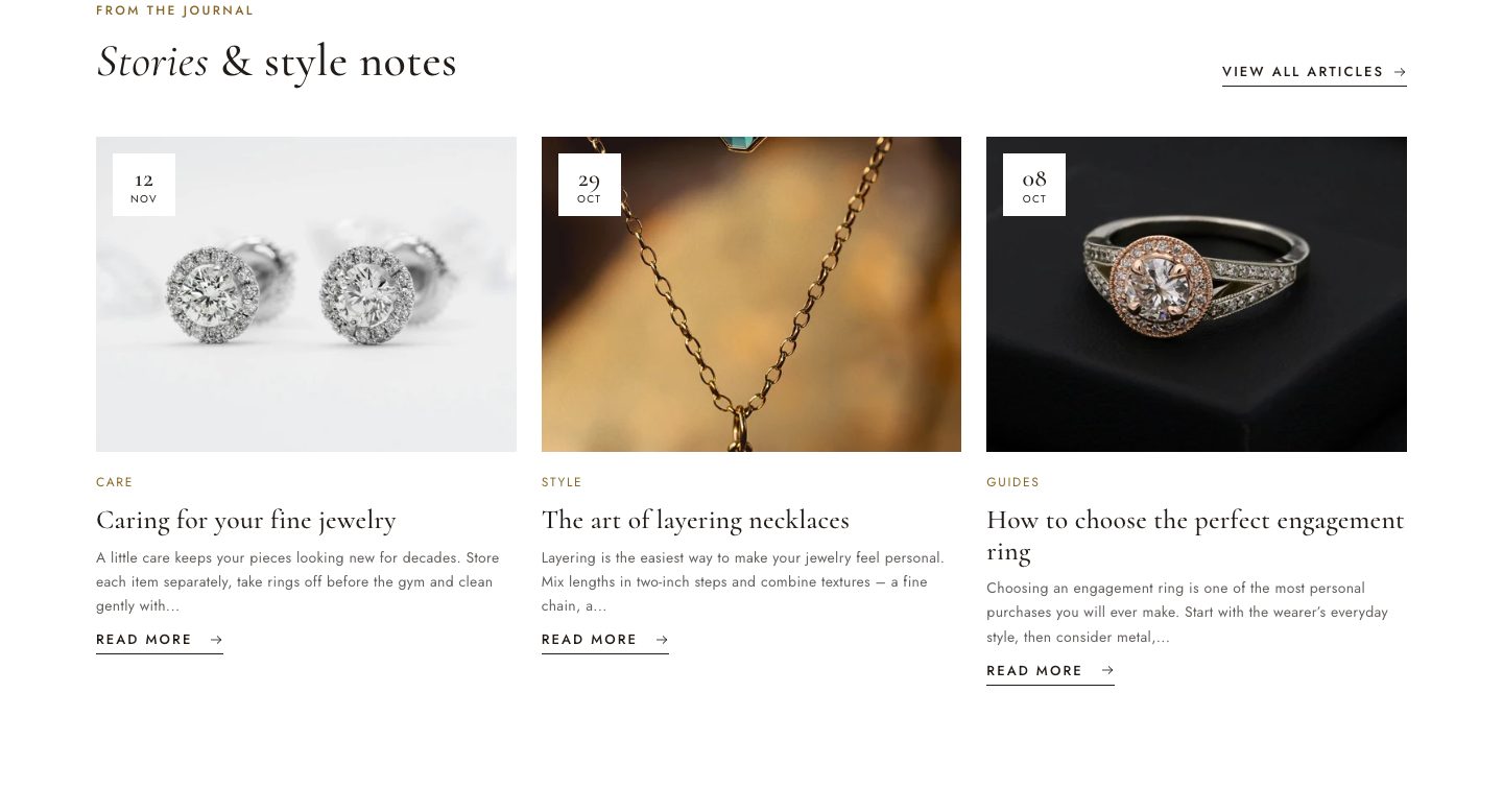
| Featured blog | The latest articles from a blog. |
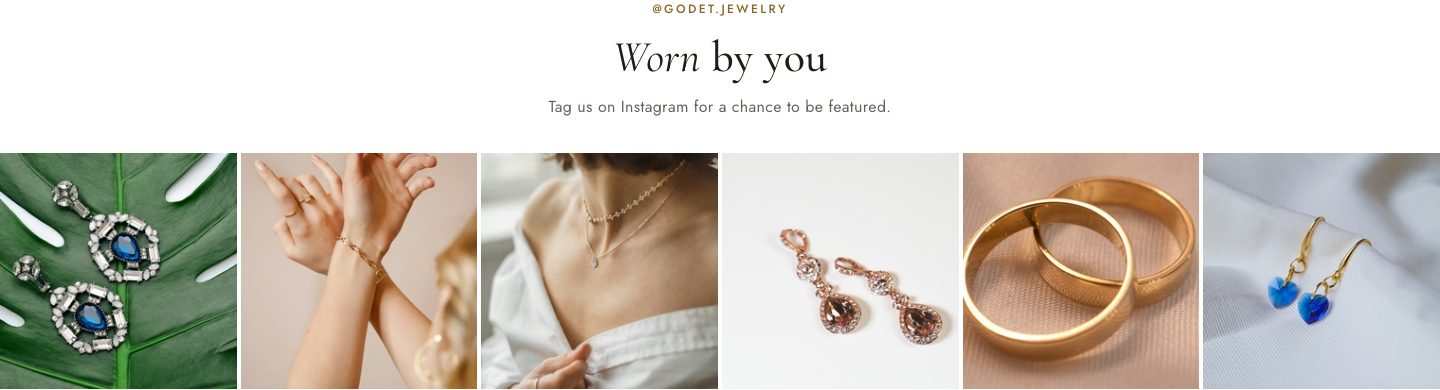
| Social gallery | A grid of images, each with an optional link, for example to Instagram posts. |
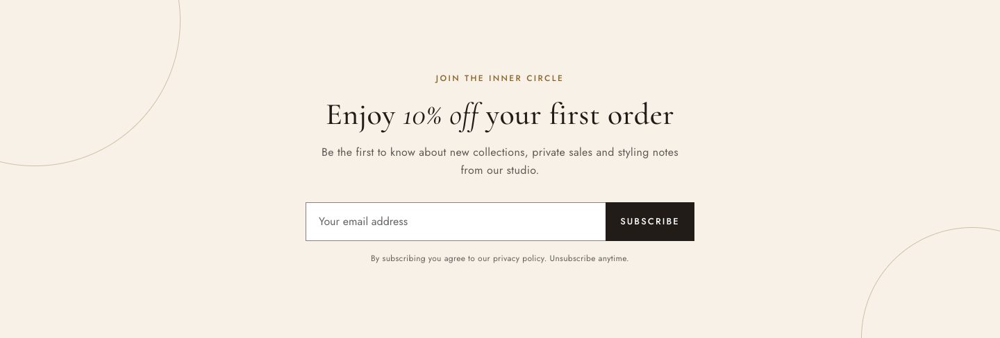
| Newsletter | Email sign-up. Subscribers are added to Customers with the tag newsletter and email marketing consent. |
| Rich text | Headings, text and buttons in any order. Use it for introductions and calls to action. |
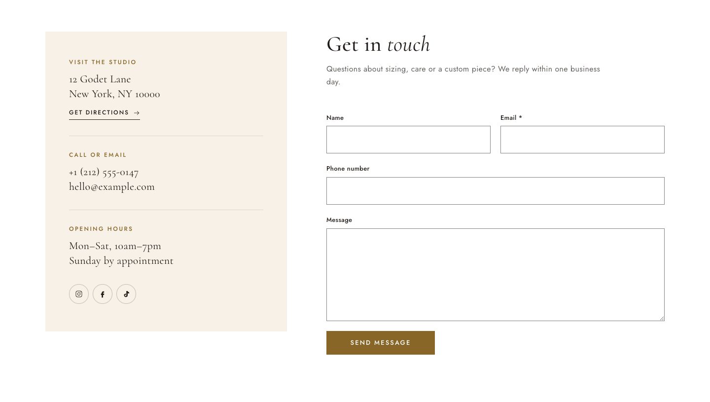
| Contact form | A contact form with an optional details panel. See Contact page. |
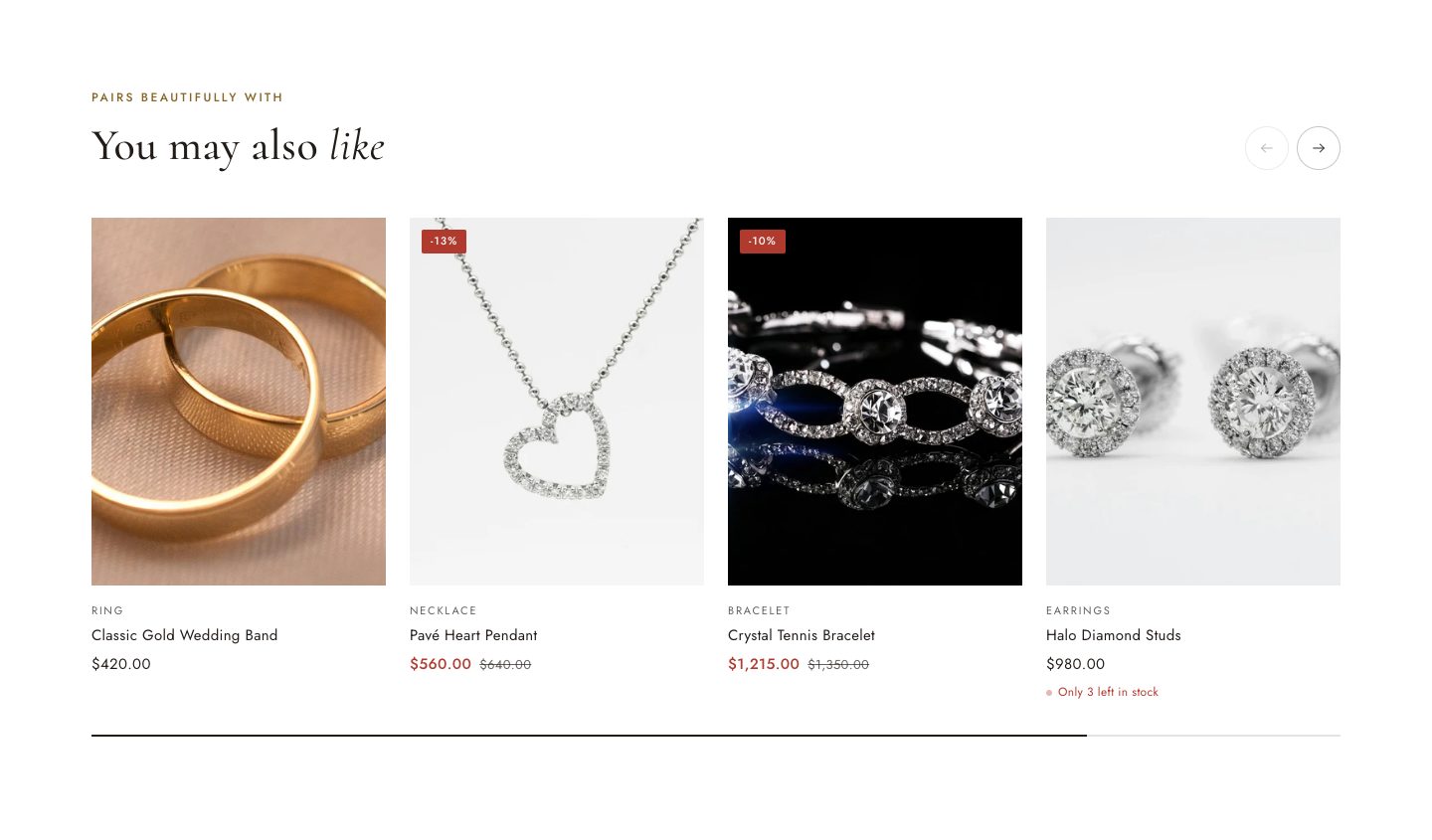
| Product recommendations | Product pages only. Related products are chosen by Shopify from order data; Complementary uses the products you set in the Search & Discovery app. |
| Custom section | Build your own layout from Group and Text blocks. |
| Custom Liquid | Paste app snippets or other Liquid code. For developers. |
| Apps | Holds blocks from installed apps. See Apps. |
Section gallery


Product page
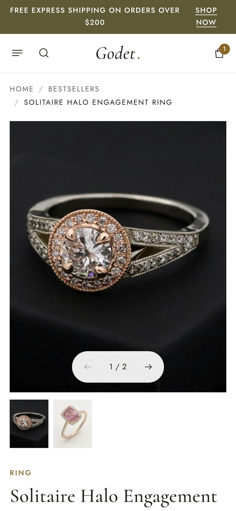
Open a product in the editor's page selector. The Product information section is built from blocks you can reorder:
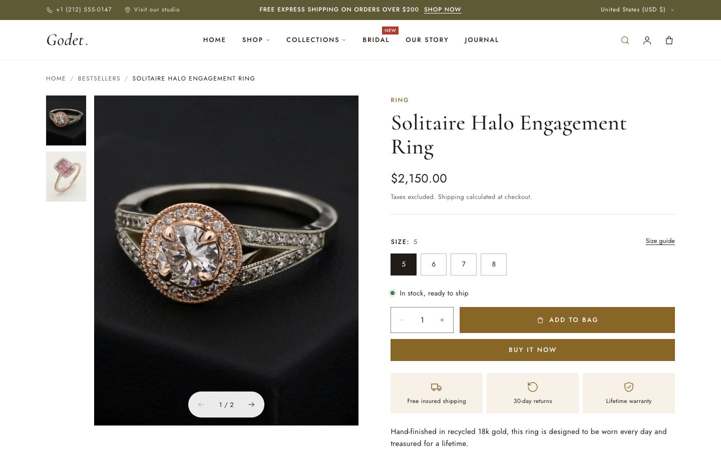
| Block | Notes |
|---|---|
| Text | Shows the product type, vendor or custom text above the title. |
| Title | The product name. |
| Rating | Shows stars from a reviews app that saves ratings in the standard reviews.rating metafield (for example Judge.me). |
| Price | Price, compare-at price with savings, unit price and an optional tax and shipping note. Shows “Volume pricing available” when it applies. |
| Payment terms | Shop Pay Installments messaging, when it's available in your store. |
| Variant picker | Option buttons, with color or image swatches when they're set on the option values. Sold-out combinations are crossed out. See Size guide. |
| Inventory | In stock, low stock or available-to-order messages, using the Low stock threshold. |
| Buy buttons | Quantity, Add to bag, dynamic checkout buttons (Shop Pay, Apple Pay and others), gift card recipient form, pickup availability, purchase options for subscriptions, and quantity rules with volume pricing. |
| Icon with text | Up to three small reassurance badges, such as free shipping, returns or warranty. |
| Description | The product description from your admin. |
| Collapsible tab | Accordions for details, care or shipping. Use the text field, or choose a page to reuse the same content on every product. |
| Share | A share button for the product link. |
| Custom Liquid / app blocks | For app widgets and custom code. |
Section settings: Show breadcrumbs and Show sticky add-to-bag bar. The sticky bar slides up once the main button scrolls out of view.
Media
Images, videos, YouTube or Vimeo links and 3D models all work in the gallery. If you link an image to a variant in your admin, selecting that variant shows its image.
Size guide
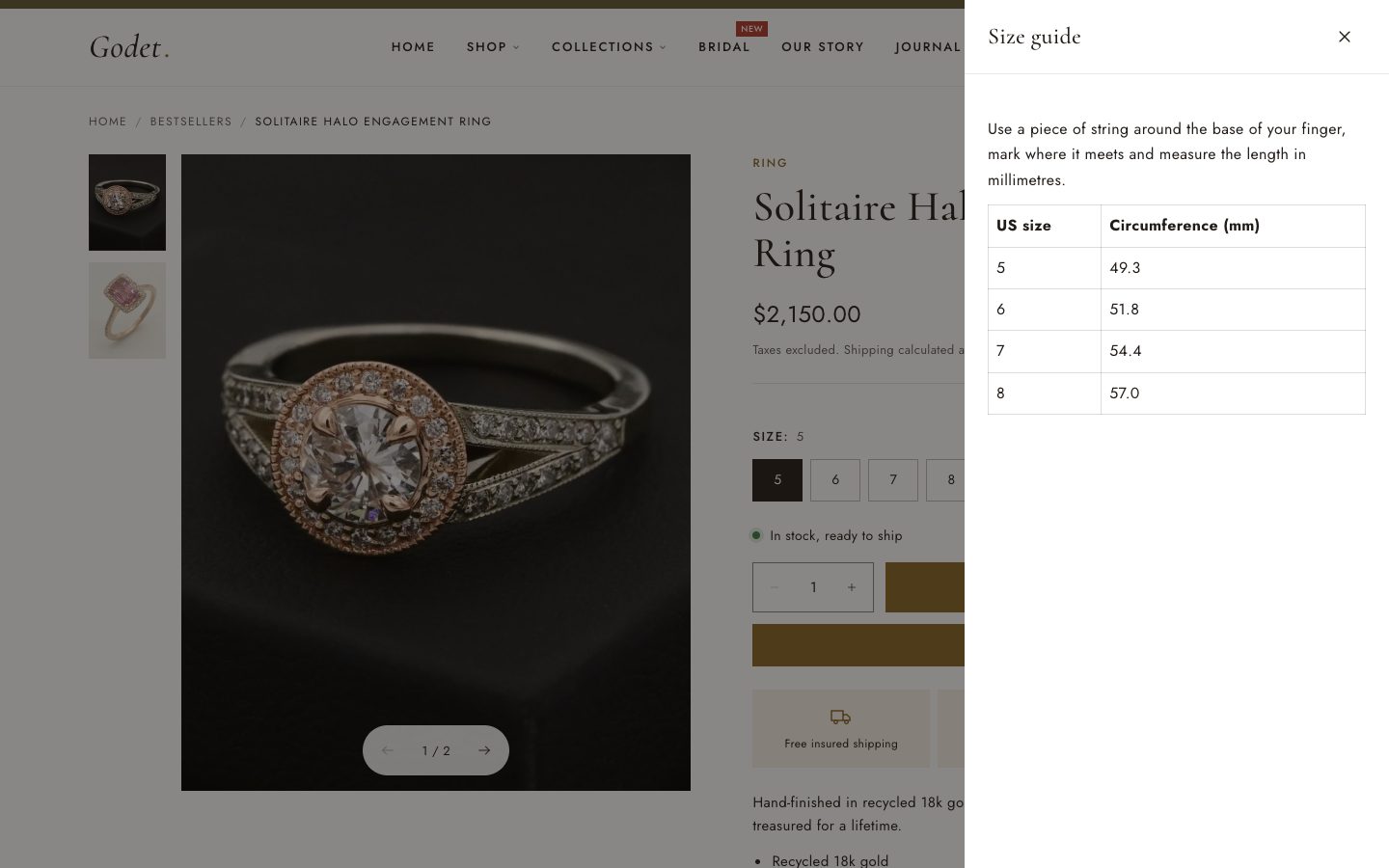
- Create a page, for example “Ring size guide”, with your sizing table.
- In the Variant picker block, choose it as Size guide page.
- In Show size guide for options, list the option names it applies to, separated by commas. The default is
Size, Ring size.
A “Size guide” link appears next to those options and opens the page in a side panel.
Gift cards
Gift card products show a recipient form so shoppers can send the card to someone else, with a name, a message and a delivery date. Turn it off in the Buy buttons block with Show recipient form for gift cards.
Pickup in store
When local pickup is set up in Settings → Shipping and delivery, the product page shows whether the selected variant can be picked up at your pickup location, with its usual pickup time.
Collections and search
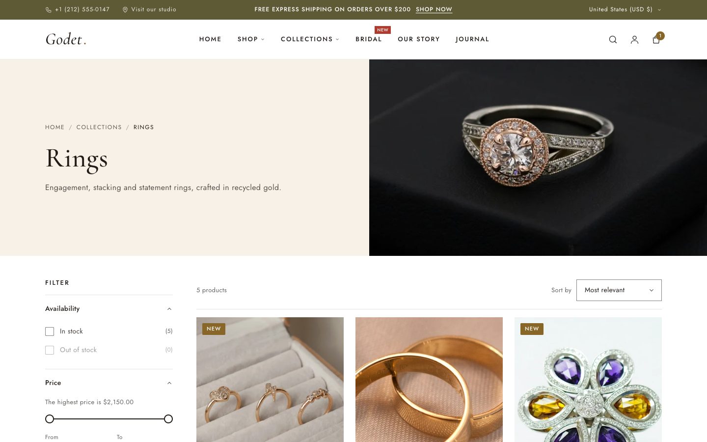
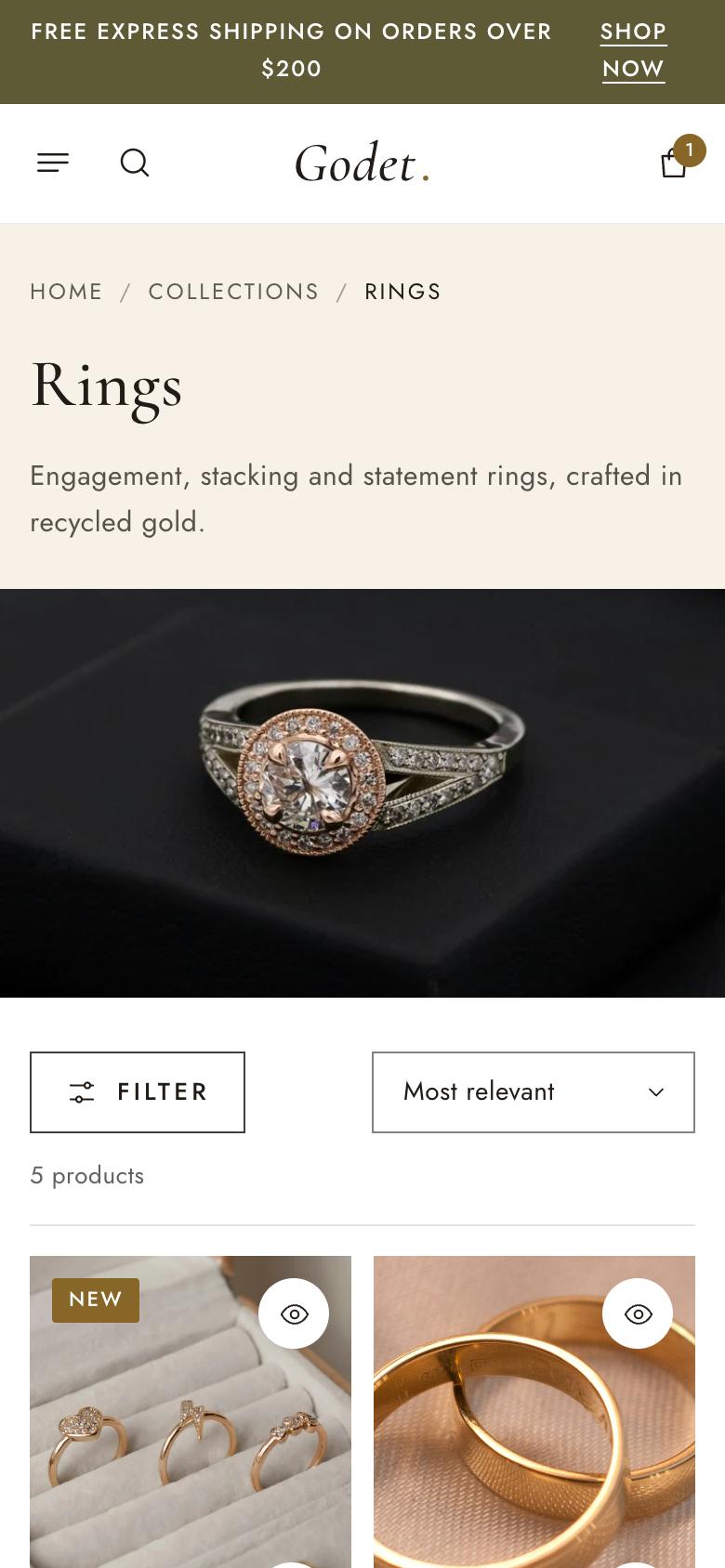
- Collection banner: the title, description and image come from the collection in your admin. Add Collection link blocks to show quick links to related collections.
- Product grid: products per page, desktop columns, and one or two columns on mobile.
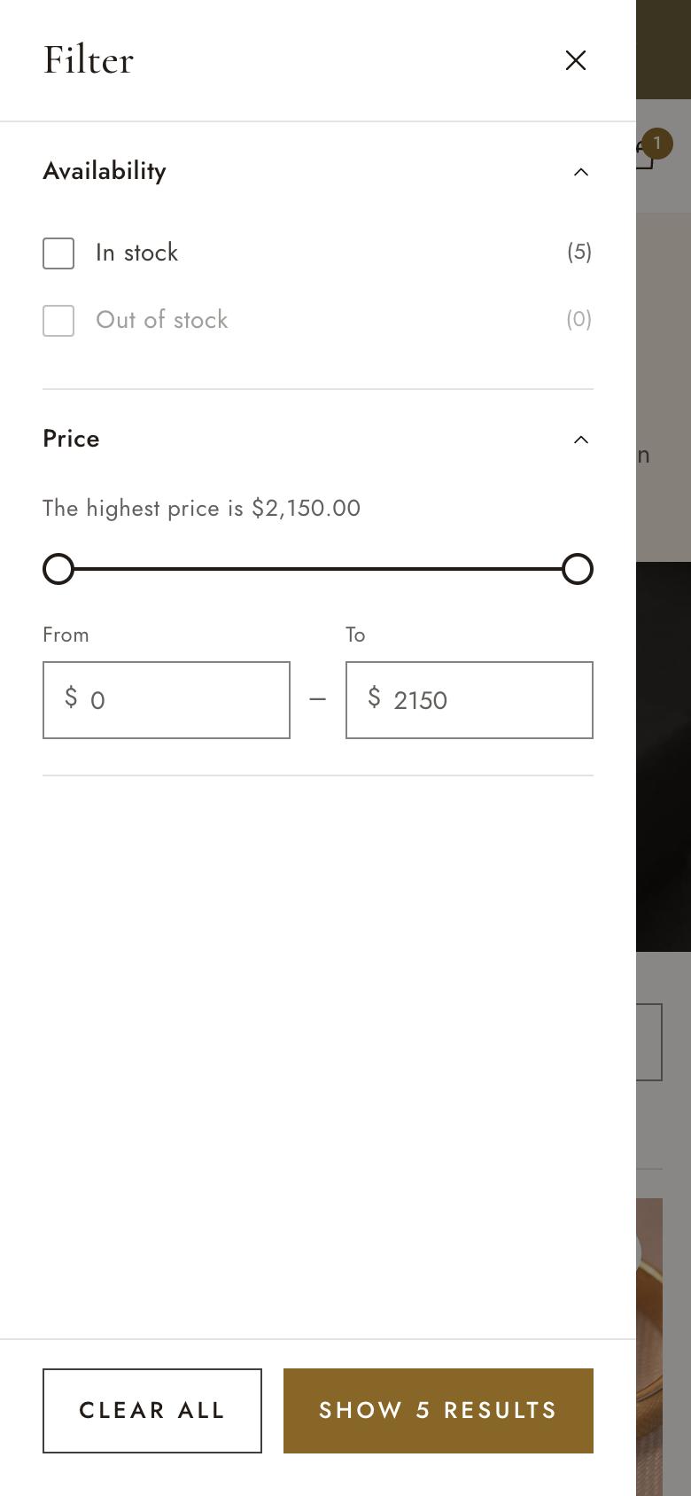
- Filtering and sorting: turn on Enable filtering and choose which filters to show (price, availability, color, metal and so on) in Shopify's free Search & Discovery app. Filters open in a side panel and update the results without reloading the page.
- Collections list page (
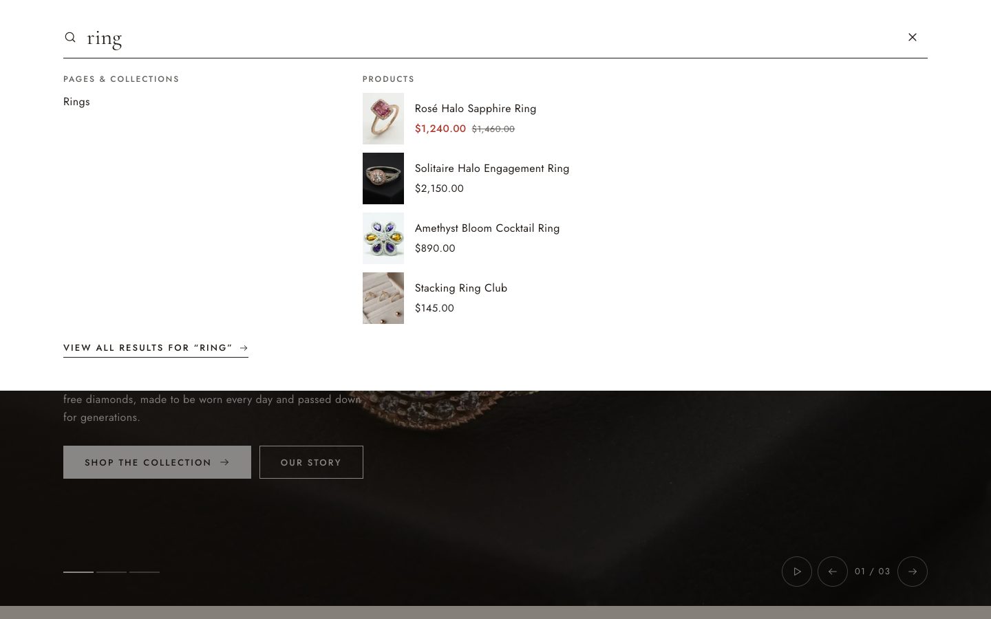
/collections): choose collections and their order, and optionally show the first two large. - Search: as shoppers type, suggestions for products, collections and pages appear. The results page has the same filters and sorting as collections.
Cart
Both the drawer and the cart page support quantity changes, order notes (turn on Enable order notes), applied discounts, the free-shipping progress bar, subscription details, and dynamic checkout buttons. Quantity rules (minimum, maximum and increments) are enforced in the cart.
About and contact pages
Godet includes two ready-made page templates.
- Go to Online Store → Pages → Add page and create “About us” (or “Contact”).
- In the page's Theme template menu (on the right), choose
about(orcontact) and save. - Open the page in the theme editor to edit its sections.
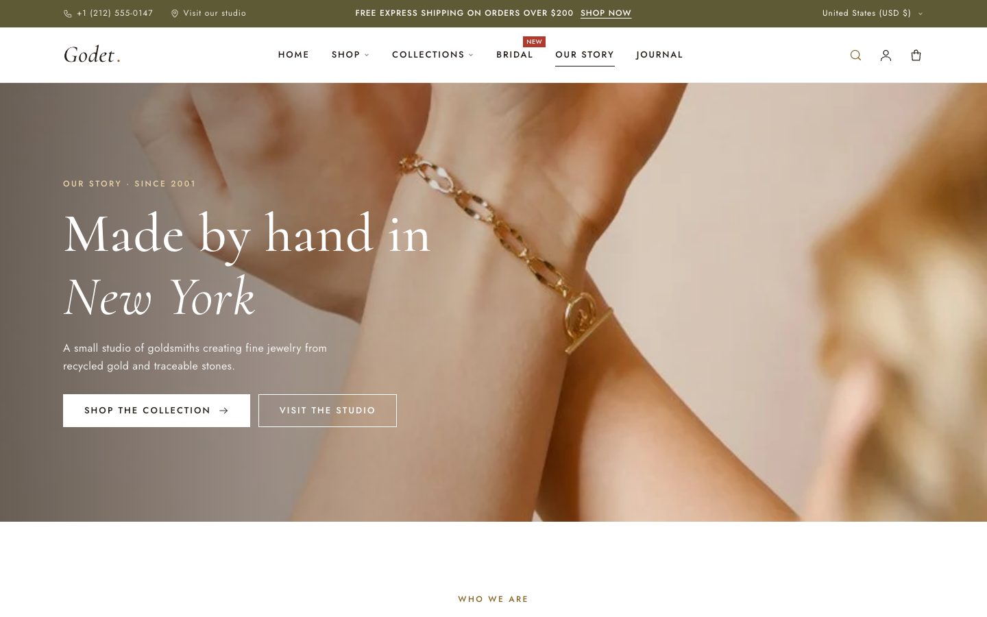
About combines a slideshow hero, an introduction, image with text and stats, values columns, a timeline, testimonials and a visit-the-studio call to action. Contact pairs the contact form with a panel for address, phone, email, hours and social links. Messages from the contact form are sent to your store's email address (Settings → Store details).
about template.contact template.Blog
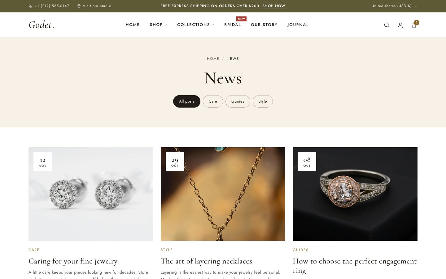
- Blog posts: articles per page, tag filter, date and excerpt.
- Blog post: featured image, date, author and breadcrumbs. Comments appear when they're turned on for the blog in Online Store → Blog posts → Manage blogs.
Accounts, password and gift cards
- Customer accounts: login, registration, order history, order details and address book are all styled to match the theme. The header account icon uses Shopify's account component, so customers can sign in with Shop or by email without leaving the page.
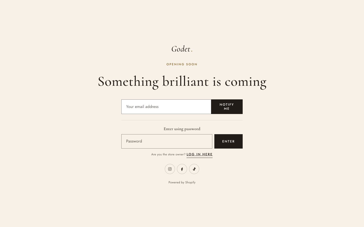
- Password page: shown while your store is password protected. It has a logo, a heading and an optional newsletter sign-up to collect launch interest.
- Gift card page: what customers see when they open a gift card email. It shows the code, the balance, a QR code, an Add to Apple Wallet button and a print button.
Subscriptions and B2B
Subscriptions
Install a subscription app, such as Shopify Subscriptions, and create a plan for your products. Godet then shows Purchase options on the product page: one-time purchase plus each subscription plan with its price. The selected plan updates the price, is added to the cart, and is shown in the cart.
Quantity rules and volume pricing
With B2B catalogs you can set minimum and maximum quantities, order increments and price breaks per product. Godet shows these rules under the quantity selector, shows how many are already in the cart, and lists price breaks in a Volume pricing table.
Languages and markets
- All storefront text is translatable. To change wording such as “Add to bag”, go to Online Store → Themes → ⋯ → Edit default theme content.
- Godet ships with translations of all theme text in 21 languages: English, Chinese (Simplified and Traditional), Czech, Danish, Dutch, Finnish, French, German, Italian, Japanese, Korean, Norwegian, Polish, Portuguese (Brazil and Portugal), Spanish, Swedish, Thai, Turkish and Vietnamese. Add a language in Settings → Languages, and translate your products and pages with the Translate & Adapt app.
- Selling in several countries? Set up Settings → Markets. The country/region selector in the announcement bar and footer then lets shoppers switch currency.
Apps
Apps that support Online Store 2.0 add app blocks, so you never need to paste code:
- On the product page, select Add block in Product information and choose the app's block (for example reviews or size charts).
- Anywhere else, add an Apps section and put the app's block inside it.
- App embeds, such as chat widgets, are turned on in Theme settings → App embeds.
Accessibility and speed
Godet is built to WCAG 2.1 AA:
- Visible focus states, a skip link, keyboard-friendly menus and drawers.
- Labelled forms, and screen reader text on icons and sliders.
- Respect for the reduced motion setting.
Pages load without jQuery or render-blocking scripts, and images load at responsive sizes.
- Add alt text to every image: in Files or on the product, select the image and choose Add alt text.
- Upload images at a sensible size, around 2400px wide for full-width banners.
- Remove apps you no longer use. Leftover app code is the most common cause of a slow store.
FAQ
My menu doesn't show a dropdown or mega menu.
Check that links are nested under the top-level item in Online Store → Navigation, and that the Header's Menu setting points to that menu.
The mega menu promo image isn't appearing.
The block's Menu item must match the top-level item's title exactly, including capital letters, and that item must have nested links.
Filters aren't showing on my collection pages.
Install Shopify's free Search & Discovery app and add filters there, then make sure Enable filtering is on in the Product grid section. Filters only appear on collections with fewer than 5,000 products.
Swatches show as plain buttons.
Swatches use the color or image set on each option value. In the product's options, choose a category with a color attribute, or link the option to a metafield that has swatches.
The Follow on Shop button doesn't appear.
It's shown only when Shop Pay is turned on in Settings → Payments, and only on the live storefront.
How do I change a button label such as “Add to bag”?
Go to Online Store → Themes → ⋯ → Edit default theme content, search for the text and change it. This works for every language.
The countdown says the offer has ended straight away.
Check the end date format: YYYY-MM-DDTHH:MM:SS, for example 2026-12-31T23:59:59, and make sure the date is in the future.
Can I use Godet for something other than jewelry?
Yes. Godet suits any premium product with a strong story: watches, ceramics, leather goods, fragrance. Change the sample text and icons to match.
Support
We're happy to help with setting up and using Godet. Email support@magexweb.com and we'll reply within two business days.
To help us answer quickly, include:
- your store URL (
your-store.myshopify.com); - the page and section where the problem happens;
- a screenshot or short screen recording;
- the theme version (shown in Online Store → Themes).
Support covers the theme's own features and settings. It doesn't cover custom code changes, third-party apps or general store setup, although we're always glad to point you in the right direction.
Changelog
1.0.0
First release.